CRO
7 Shopify Product Page Issues That Create Friction
August 16, 2026 · 3 min read
The product page is where the actual buying decision happens. Everything before it — ads, homepage, collection browsing — exists to get someone here. So it's the page worth scrutinising the hardest, and it's usually where I find the most avoidable issues during an audit.
1. Weak visual hierarchy
If the price, the "Add to Cart" button, and the core value of the product don't stand out clearly from everything else on the page, the visitor has to hunt for what matters. Every element competing equally for attention means nothing actually gets attention.
2. Features listed instead of benefits explained
"400gsm cotton" is a spec. "Thick enough that it won't go see-through after a few washes" is a benefit. Specs matter for buyers who already know what they're comparing against, but most visitors need the plain-language version first.
3. A CTA that doesn't stand out
The Add to Cart button should be the most visually obvious thing on the page. I still see product pages where it's the same colour as three other buttons, or pushed below the fold on mobile, competing with a wall of text above it.
4. Missing or vague trust signals
Return policy, shipping timeline, and any relevant guarantees should be visible near the buy decision, not buried in a footer link. If a buyer has to go looking for this information, the extra uncertainty may cause them to leave.
5. Incomplete shipping information
"Free shipping" with no timeline, or no indication of shipping cost until checkout, creates hesitation. Buyers want to know roughly when the product will arrive before they commit, especially for anything bought as a gift or for a specific date.
6. Mobile layouts that were clearly designed for desktop first
Image galleries that are hard to swipe through, variant pickers that are fiddly to tap, and text sized for a 27-inch monitor are still common. For stores with substantial mobile traffic, these issues can create meaningful friction.
7. Too many distractions before the buying decision is made
Autoplaying videos, unrelated upsell carousels, and long brand-story sections all have their place — just not necessarily above the core information a visitor needs to decide. Every extra thing competing for attention delays or derails the decision you actually want them to make.
The pattern behind all seven
None of these are necessarily dramatic failures. Stacked together across a page, they can make a product page harder to use even when it looks fine in a screenshot. The appropriate fix depends on the store, but a focused pass through the existing page is often worth testing before a full redesign.
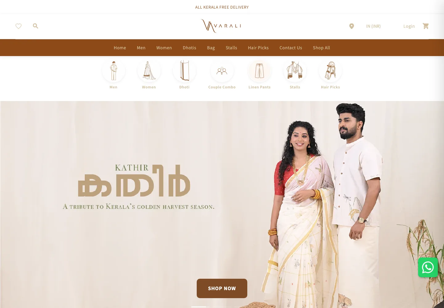
For examples of this kind of UX review in practice, see the Varali Clothing CRO audit and Bella Loungewear CRO audit.
Want these checked against your actual product pages?
I'll go through your top product pages and flag which of these issues may be creating conversion friction.
Get a Free Shopify Store Audit →